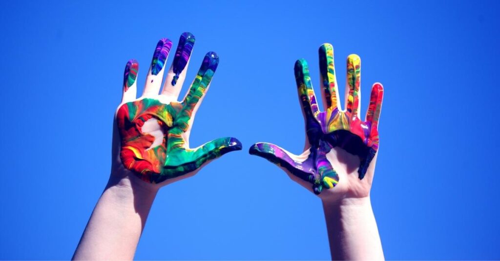
Colour psychology is a fascinating field that explores the intricate relationship between colours and human emotions and behaviours. When harnessed effectively, the power of colours can be a valuable tool in marketing, influencing customer behaviour and perception. Let’s delve deeper into the world of colour psychology, examining the emotional impact of different colours, and understanding how businesses can use this knowledge to their advantage.

Colour and Emotions: The Intricate Connection
Each colour has its own unique set of emotional associations, making it a versatile tool for marketers to convey specific messages and elicit desired responses from their audience. Here’s a closer look at some key colours and the emotions they are often associated with:
Red
The colour red is known for evoking excitement, energy, and passion. It’s often associated with love, making it a popular choice for romantic contexts. Red also conveys a sense of adventure and can grab attention effectively.
Example: Think about the iconic red heart used to symbolise love and affection, particularly on Valentine’s Day. Brands like Coca-Cola use red to create a sense of excitement and vibrancy in their marketing campaigns.
Pink
Pink represents femininity, creativity, and a gentle form of love. It’s often seen as a nurturing and compassionate colour, making it suitable for brands targeting a female audience or those promoting creativity and innovation.
Example: Breast cancer awareness campaigns frequently use pink to convey hope, support, and compassion. Cosmetic brands often incorporate pink into their packaging and branding to appeal to a female demographic.
Purple
Purple is a colour associated with art, spirituality, and creativity. It’s often linked to notions of justice and fairness and has historical connections to royalty and luxury.
Example: Cadbury, a well-known chocolate brand, uses purple in its branding to evoke a sense of luxury and indulgence, emphasising the premium quality of its products.
Blue
Blue is a colour of trustworthiness, success, and reliability. It conveys confidence and power, making it an excellent choice for businesses aiming to establish a sense of security and authority.
Example: Facebook uses blue in its logo and interface, fostering trust and reliability among its massive user base. Financial institutions often use blue to convey stability and professionalism.
Green
Green is closely associated with nature, symbolising growth, luck, and health. It’s often used to promote environmentally friendly initiatives and products and is linked to feelings of loyalty and harmony.
Example: The Starbucks logo prominently features green, aligning the brand with sustainability and nature. Companies that emphasise eco-friendliness often incorporate green into their branding.
Yellow
Yellow radiates joy, positivity, and warmth. It’s a colour that can evoke curiosity and playfulness, making it suitable for brands that want to create a cheerful and optimistic image.
Example: The yellow smiley face symbolises happiness and is often used in marketing to convey friendliness and approachability. Fast-food chains like McDonald’s use yellow in their branding to create a lively and inviting atmosphere.
Orange
Orange is associated with originality, youthfulness, optimism, and enthusiasm. It’s a vibrant colour that can energise and excite viewers.
Example: The Home Depot uses orange in its branding to convey a sense of DIY creativity and enthusiasm for home improvement projects. Nickelodeon, a children’s television network, incorporates orange into its logo to appeal to a youthful audience.

How to Use Colour Psychology: Strategies for Marketers
Understanding the emotional impact of different colours is just the beginning. To effectively leverage colour psychology in marketing, businesses can adopt several strategic approaches:
1. Decide Your Marketing Goal and Choose a Colour
Start by defining your marketing objective. Are you aiming to create a sense of trust and reliability, or do you want to evoke excitement and passion? Once you have a clear goal, choose a colour that aligns with that objective. For example, if you want to convey trustworthiness, blue may be your colour of choice.
2. Get Inspired by Other Brands
Study successful brands in your industry or those with similar target audiences. Analyse their use of colour in branding and marketing. While it’s essential to stand out, observing what works for others can provide valuable insights.
3. Keep colours Consistent
Consistency is key when using colour psychology in marketing. Ensure that your chosen colour is consistently used across all your branding materials, from logos to advertisements and packaging. Consistency builds brand recognition and reinforces emotional associations with your brand.
4. Create a Brand Colour Palette
Establish a comprehensive colour palette that includes primary and secondary colours. This palette should guide your design choices and maintain visual coherence across various marketing channels.
5. Use Blue When Uncertain
If you’re unsure about which colour to use, blue is often a safe and versatile choice. It appeals to a broad range of emotions, from trust and reliability to confidence and success. Many global brands use blue as a primary or secondary colour in their branding.
6. Run Colour Tests
Conduct A/B tests or surveys to gauge the impact of different colours on your target audience. This data-driven approach can help you fine-tune your colour choices for optimal results.

Conclusion
Colour psychology is a potent tool that can significantly impact consumer behaviour and perception. By understanding the emotional associations of different colours and applying strategic approaches, businesses can harness the power of colour to convey their desired messages and foster strong connections with their audience. Whether you aim to create trust, excitement, or positivity, the right use of colour can make a world of difference in your marketing efforts.


