Logos and trademarks have long been the visual ambassadors of brands. A well-designed logo has the power to instantly trigger brand recognition and convey a multitude of associations and emotions. In today’s marketing landscape, there’s a noticeable shift towards logos that are not just memorable but also larger in scale. This trend is prevalent across various industries, including luxury goods, automotive, and fashion. So, why are logos becoming larger, and what considerations should go into creating one?

The Rise of Larger Logos
Visibility and Recognition: In the world of marketing, the adage “bigger is better” often holds true. Large logos are easier to spot and recognize, whether it’s on a billboard, a storefront, or a social media post. The increased size enhances visibility, ensuring that the brand doesn’t get lost in the noise.
Repeated Exposure: Larger logos create a lasting impact through repeated exposure. When consumers encounter a brand’s logo frequently and prominently, it reinforces brand recall and strengthens the connection between the logo and the brand’s identity.
Pride and Status: Owning products featuring larger logos can evoke a sense of pride and status in consumers. Displaying a prominent logo can be a way for individuals to showcase their association with a particular brand or lifestyle.
Social Media Influence: The ubiquity of social media plays a significant role in the trend towards larger logos. As more people share their experiences and possessions on platforms like Instagram and TikTok, brands are keen to ensure that their logos are prominent in user-generated content. This organic exposure is highly valuable.
Sales and Market Demand: Perhaps the most persuasive factor for brands is the increased sales of products featuring large logos. The demand for such items is a compelling incentive for brands to design more products with prominently displayed logos.

Considerations When Creating Logos
When embarking on the creation of a logo, several pivotal considerations must guide the design process to ensure the logo effectively represents the brand and resonates with the target audience. Choosing the right style is the first step. The logo’s style should not only reflect the industry’s characteristics but also meet the target audience’s expectations. An instantly recognizable logo, like a slice of pizza for a pizzeria, paired with an appropriate color scheme, can significantly enhance brand recognition and convey the nature of the business effectively.
Understanding the target audience is crucial for the logo’s success. A logo’s design should resonate with the intended demographic, necessitating a deep dive into their preferences, values, and behaviors. This understanding enables the creation of a logo that not only captures the essence of the brand but also connects emotionally with the audience, fostering brand loyalty and recognition.
Font selection is another critical aspect of logo design in the digital age. The chosen font must be clear, distinctive, and readable across various platforms and devices to ensure the brand is easily identifiable. The logo’s legibility is paramount, particularly in an era where digital presence spans across multiple devices and screen sizes. A well-chosen font contributes to the logo’s overall impact and brand recall.
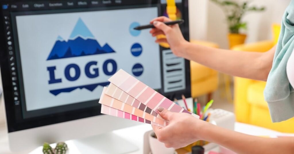
The color scheme and versatility of the logo are key factors. Colors evoke emotions and can communicate the brand’s personality, making the choice of colors a strategic decision. Using tools like Adobe Color can help find a harmonious palette that aligns with the brand’s values and enhances visual appeal. Additionally, a logo must be versatile, capable of adapting to various mediums and sizes without losing its essence. This adaptability ensures the logo remains effective and recognizable, whether it’s displayed on a mobile screen or a billboard, contributing to the brand’s longevity and success.
An Example of the Large Logo Trend
An excellent example of the trend towards larger logos can be found in the fashion industry, particularly with luxury brands. Take the iconic Louis Vuitton logo, for instance. In recent years, Louis Vuitton has embraced the trend of prominently displaying its iconic monogram on a range of products, from handbags to sneakers. The oversized monogram has become a symbol of luxury and status, and consumers actively seek out products that prominently feature this logo.

Additional Considerations for Logo Creation
In the process of creating a logo, uniqueness plays a pivotal role. A logo should not only capture the essence of the brand but also stand out in a crowded marketplace. This necessitates steering clear of designs that bear too close a resemblance to those of competitors, as such similarities can lead to confusion among consumers. The goal is to design a logo that is distinctive enough to be instantly recognizable as associated with your brand, thus avoiding any potential brand identity mix-ups and fostering a unique brand image.
Timelessness is another crucial factor to consider in logo creation. While it might be tempting to incorporate elements that are trendy at the moment, it’s important to remember that trends are fleeting. Aiming for a timeless design ensures that your logo remains relevant and effective across different eras, eliminating the need for frequent redesigns. This approach not only solidifies brand recognition over time but also contributes to a consistent and enduring brand identity that resonates with audiences for years to come.
Simplicity in logo design cannot be overstated. A logo that is simple and uncluttered stands a better chance of being memorable and versatile. Simplicity ensures that the logo can be easily recognized and reproduced across various mediums and sizes, from digital screens to physical merchandise, without losing its integrity. This principle of simplicity aids in creating a logo that is effective in its communication and adaptable to a wide range of applications, enhancing the overall brand presence.
Finally, incorporating feedback and testing into the logo design process is essential. Gathering insights from a diverse group of individuals can provide valuable perspectives that might not have been considered otherwise. Testing the logo in different contexts and with real users helps identify any potential issues, such as scalability problems or misinterpretations of the design. This step ensures that the final logo is not only visually appealing but also functional and effective in representing the brand across all intended platforms and audiences.
Summary
The trend of larger logos is a response to the evolving dynamics of marketing, where visibility, recognition, and consumer preferences play pivotal roles. When creating a logo, careful consideration of the target audience, industry, font, colour scheme, versatility, uniqueness, timelessness, simplicity, and user feedback can lead to the development of a logo that not only stands out but also resonates with consumers across various mediums and contexts.


