fbpx
Categories
Blog Search Engine Optimisation

Spending a week to complete all ALT texts? How you can do it smarter?

Images are not merely visual embellishments; they are powerful communicators. However, there is a significant portion of your audience that doesn’t experience your website in the same visual way – those with vision impairments. To bridge this gap and ensure inclusivity, we turn to a humble yet invaluable HTML attribute: alt text.

woman thinking

The Essential Role of Alt Text

Alt text, short for “alternative text,” is a fundamental component of web accessibility. It serves a dual purpose:

Accessibility: Alt text provides a textual description of an image for users who may not be able to see it. This description is read aloud by screen readers, enabling those with visual impairments to understand and engage with the content.

SEO (Search Engine Optimization): Beyond its accessibility benefits, alt text plays a pivotal role in SEO. Search engines like Google rely on alt text to comprehend and index images on websites. Properly optimised alt text can improve a site’s visibility and ranking in search results.

discussing together

The Alt Text Strategy

As websites host a multitude of images, devising a pragmatic strategy for implementing alt text is essential. The process can be both time-consuming and intricate. Here’s a strategic approach to ensure comprehensive alt text coverage without overwhelming your resources:

1. Prioritise High-Traffic Pages: Begin by identifying and focusing on pages that receive the highest visitor traffic. These pages are likely to benefit the most from alt text optimization. Gradually work your way through the hierarchy of your website, prioritising based on importance and relevance.

2. Integrate Alt Text into Workflow: To ensure consistent alt text inclusion, make it a routine part of your content creation and publishing workflow. Most Content Management Systems (CMS) have streamlined the process, offering user-friendly interfaces for adding alt text during image uploads. However, in some cases, like Shopify, users may need to manually input alt text for each image. Establish clear guidelines and training for your content creators and editors.

3. Contextual Alt Text: Alt text should extend beyond mere descriptions. Provide context that conveys the image’s purpose and relevance to the page’s content. For instance, if an image depicts a hot air balloon over a canyon, the alt text should read “Hot air balloon floating above the majestic canyon.” This not only enhances accessibility but also aids search engines in understanding the image’s context.

4. Avoid Keyword Stuffing: While it’s crucial to incorporate relevant keywords into your alt text, resist the temptation to engage in keyword stuffing. Search engines prioritise natural, informative alt text over keyword-heavy alternatives. Aim for grammatically correct sentences that encapsulate the image’s essence.

5. Regular Updates: Alt text should not be a one-time endeavour. As your website evolves and new images are added, revisit and update alt text regularly. Ensuring that alt text remains accurate and aligned with your website’s content is crucial for both accessibility and SEO.

woman typing on laptop

The Power of Alt Text in SEO

Alt text is not merely an accessibility requirement; it is a potent SEO tool. Here’s how optimising alt text can enhance your website’s search engine performance:

1. Improved Indexing: Search engines rely on alt text to understand the content of images. By providing descriptive and context-rich alt text, you assist search engines in indexing your images accurately. This, in turn, increases the visibility of your website in relevant search results.

2. Enhanced User Experience: Alt text optimization doesn’t stop at pleasing search engines; it also benefits your audience. When users conduct image-based searches or utilise screen readers, well-crafted alt text ensures they receive meaningful and relevant results, enhancing their overall experience.

3. Potential for Image Search Traffic: Alt text can make your images discoverable through image search engines like Google Images. This opens up an additional avenue for organic traffic to your website.

4. Keyword Association: Alt text provides an opportunity to associate relevant keywords with images. This strategic use of keywords can strengthen your website’s thematic relevance and authority in specific subject areas.

Alt Text’s Multifaceted Value

Alt text transcends its role as a mere accessibility requirement; it’s a versatile tool that impacts both user experience and search engine visibility. By embracing a systematic approach to alt text implementation and optimization, you can ensure that your website is inclusive, informative, and well-positioned in the digital landscape. Elevating your alt text game is not just a matter of compliance; it’s a step toward a more accessible and SEO-friendly online presence.

Categories
Blog Content Marketing Digital Experience

7 design tips to improve readability on screens

Reading content on screens is an integral part of our digital lives. Whether it’s browsing websites, using applications, or consuming digital media, the way we read on screens differs significantly from traditional paper-based reading. Screens emit light, which can strain the eyes and impact readability. Designers and developers recognize these challenges and have tailored their approach to enhance readability and create a better user experience. In this comprehensive guide, we will delve into seven essential design tips to improve readability on screens.

font text

7 tips to improve readability of websites and mobile applications

1. Fonts: Choose Wisely

The choice of font is a fundamental aspect of on-screen readability. Fonts can be broadly categorised into two families: serif and sans-serif. Serif fonts, such as Times New Roman, feature small decorative lines at the end of strokes, while sans-serif fonts, like Arial, do not have these adornments.

While serif fonts may convey sophistication and elegance, they are often avoided for small text and long paragraphs on screens. The decorative lines of serif fonts can clutter the limited screen space, especially on smaller screens and lower resolutions. Sans-serif fonts offer a cleaner and more legible appearance on screens, enhancing text contrast and making reading more comfortable.

2. Font Size: Find the Right Balance

Font size is a critical factor in digital typography. Choosing the appropriate font size can significantly impact readability and user experience. Technology adoption spans across diverse age groups and abilities, making it essential to consider accessibility.

Smaller text may lead users to zoom in for readability, decreasing accessibility and user comfort. On the other hand, excessively large text can result in more scrolling and disrupt the flow of content. Designers aim to strike a balance by selecting font sizes that cater to the target audience’s needs and preferences.

3. Caps: Use Sparingly

Writing text in all capital letters can convey emphasis, but it should be used judiciously. In online communications, writing in all caps is often considered impolite and equivalent to shouting. From a readability standpoint, using all caps can make long sentences challenging to read, reducing reading speed and user satisfaction.

Instead of using all caps extensively, consider employing capitalization strategically to maximise the impact of specific words or phrases. This ensures that readability and user experience remain a priority.

typing on laptop

4. Alignment: Left is Right

Text alignment plays a crucial role in determining where users begin reading the next line. Left-aligned text is generally considered the most readable for large blocks of text. This alignment creates a consistent starting point for the eye at the beginning of each line, facilitating smoother reading.

Centre-aligned and right-aligned text can be used effectively for headings or smaller blocks of text. However, for lengthy paragraphs, left alignment is recommended to optimise readability and user comfort.

5. Contrast: Ensure Visibility

Contrast refers to the difference in luminosity (lightness) between the text and its background. To improve readability, text should stand out sufficiently from the background. The most effective combinations for contrast are black text on a white background or white text on a black background.

Designers and developers can follow the Web Content Accessibility Guidelines (WCAG) to ensure that their colour choices meet quantifiable contrast ratios. Adequate contrast not only enhances readability but also makes content accessible to individuals with visual impairments.

6. Line Spacing: Create Breathing Room

Line spacing, also known as line height, refers to the space between lines in a paragraph. Increasing line spacing can enhance legibility by making it easier for readers to distinguish each line. It prevents text from feeling cramped and allows readers’ eyes to move smoothly from one line to the next.

However, excessive line spacing can lead to longer paragraphs on the screen, necessitating additional scrolling. Designers aim to strike a balance, ensuring that line spacing improves readability without unnecessarily elongating the content.

7. Line Length: Avoid Extremes

The length of a line of text, often referred to as line length or line width, can significantly impact readability. If a line of text is too long, readers may struggle to focus on the text, as it becomes challenging to gauge where a line starts and ends. This can lead to reading errors and eye strain.

Conversely, if lines are too short, readers may experience frequent line breaks, disrupting their reading rhythm and causing stress. Striking the right balance in line length is essential for creating a comfortable reading experience.

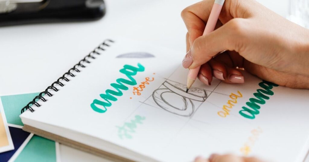
drawing alphabets

Summary

Improving readability on screens is a multidimensional endeavour that involves careful consideration of fonts, font size, alignment, contrast, line spacing, and line length. Designers and developers must prioritise user experience and accessibility when crafting digital content. By implementing these seven design tips, you can create content that is not only visually appealing but also comfortable to read and navigate on screens. Remember that the goal is to enhance user engagement and comprehension, ultimately leading to a more satisfying and effective digital experience.